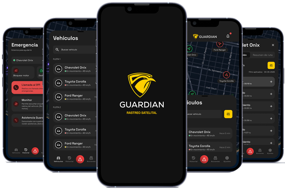
Redesign of a vehicle tracking app.
UX audit, design and complete redesign of a mobile satellite tracking app for vehicle owners.
Study:

Tools:


UX audit, design and complete redesign of a mobile satellite tracking app for vehicle owners.
Study:
Tools:
Guardian is a satellite tracking app (iOS/Android) that gives users full control over their vehicle: real-time location tracking, remote engine start and stop alerts in the event of theft, with coverage across Uruguay, Mercosur, Peru and Bolivia, and installation in 40 minutes.
Project timetable
1
The problem
A functional app, but one that’s difficult to use
Guardian is a vehicle tracking app that already had active users, but was plagued by long-standing usability issues, visual inconsistencies and unresolved product decisions. The client needed to understand exactly what was going wrong before continuing to develop the app.
2
The process
UX audit: understand before you design.
The first step was a comprehensive UX audit of the existing app. We documented 50 findings organised by category: interaction issues, implementation bugs, visual inconsistencies and product decisions requiring client validation.
Guardian today
50
Documented UX findings. 6 categories – 18 critical issues.
6 categorías - 18 críticos.
2
Native platforms supported: iOS, Android, light and dark modes.
6
Redesigned workflows. Wireframes and interactive prototype.
Wireframes y prototipo interactivo.
Our process
19
Departments covered: All of Uruguay,
5
Coverage categories: Cars, motorbikes, lorries, pets and people
6
Countries with international coverage: Mercosur, Chile, Bolivia and Peru.
3
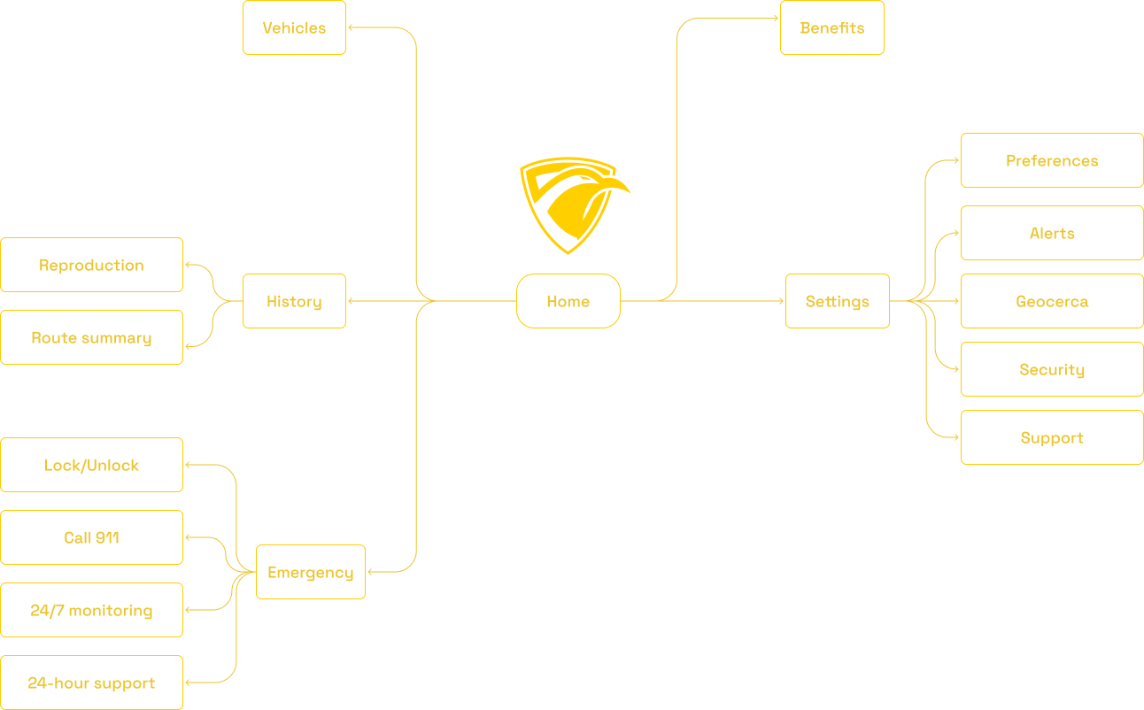
App Map
The skeleton after the experiment.
We’ve stripped navigation down to the essentials: rather than organising by function, we organise by what the user needs to do at any given moment.
4
Sistema de diseño
Tokens, rather than screens.
Before designing individual screens, we laid the foundations for the system: colour tokens, typography and components. This ensures consistency in implementation and scales well as the app grows.
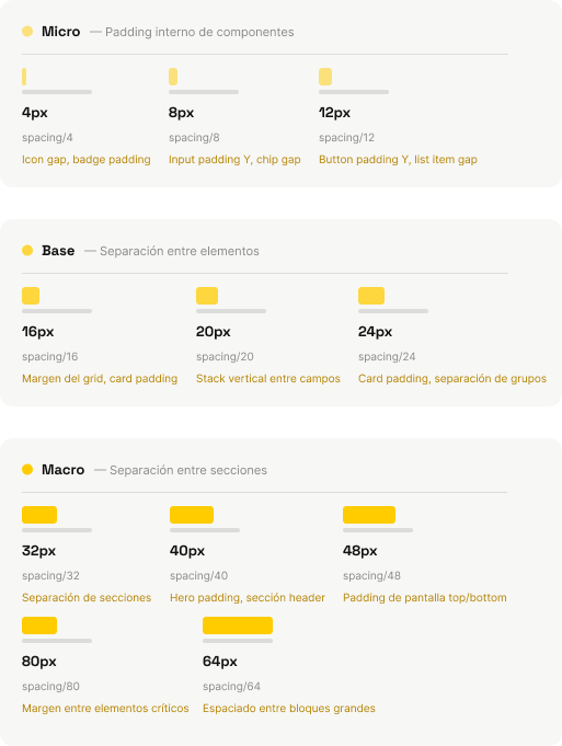
Spacing Scale
Aa
Typography: Space Grotesk

Colour palette
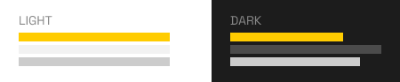
Presentation formats
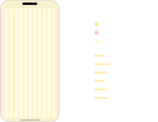
Frame base & Grid
5
Screen Design
Redesign, screen by screen.
With the audit completed and the design system defined, each screen was redesigned based on the findings: broken workflows were corrected, missing states were added, the visual hierarchy was clarified, and it was ensured that critical actions were given the correct prominence and protection.
Crítical:
Insecure command interface: The engine shut-off button was mixed in with routine actions, without prior confirmation.
Important:
The map uses colors to indicate the vehicle's status (green, yellow, red) without any explanatory legend.
Improvement:
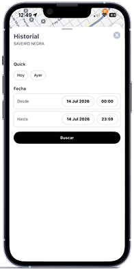
Empty screens without “empty state” indicators; the app didn't display anything when there was no data.
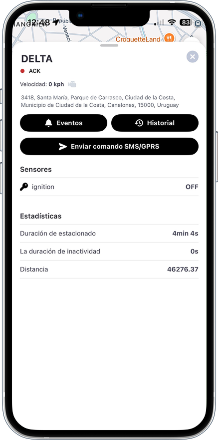
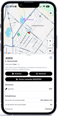
Before
Needs improvement:
- Status in technical code (“ACK”), unreadable outside the backend.
- Complete address with no hierarchy: neighborhood, city, department, and ZIP code all given equal weight.
- Statistics without units or context (“Distance 46276.37”).
- No event logging: it is unknown what happened or when. - “Send SMS/GPRS command” as the main action, exposed without protection.
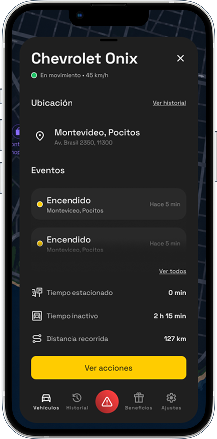
After
Results:
- The vehicle is identified by model
- Status displayed in natural language, including current speed
- Location summarized to the essentials, with access to history
- Statistics with units and icons, readable at a glance
- Recent events visible, with access to the complete list
- Actions grouped under a single entry point, separate from data viewing
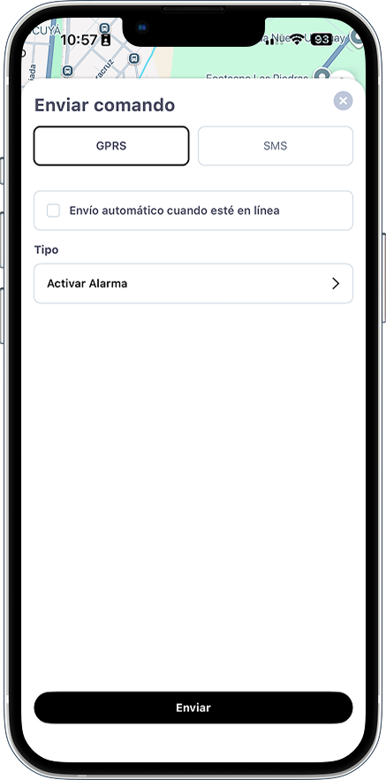
Before
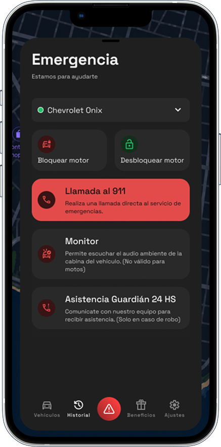
Needs improvement:
- Technical screen focused on protocol (selecting GPRS/SMS) rather than user needs.
- No clear distinction between emergency and routine actions.
- No direct access to human assistance or emergency calls.
- Unused empty space; poor visual hierarchy.
After
Results:
- Actions grouped by user purpose (lock/unlock engine).
- Visually distinct emergency section (red color, separate hierarchy) for theft situations.
- Direct access to 911 and 24-hour Guardian Assistance.
- Vehicle selector visible at the top; the same actions apply to any car without having to go back.
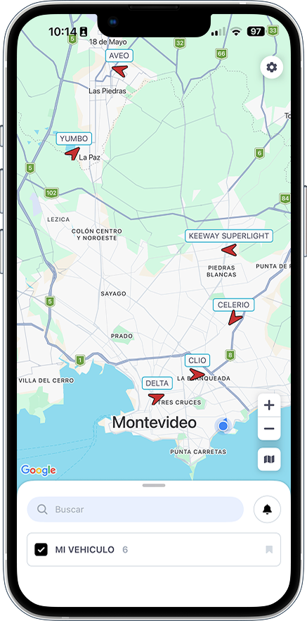
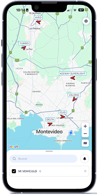
Before
Needs improvement:
- Full fleet view, with all vehicles visible without grouping or prioritization.
- Bottom list reduced to a single checkbox (“MY VEHICLE”) with no status information.
- No brand identity visible on the screen.
- No global navigation.
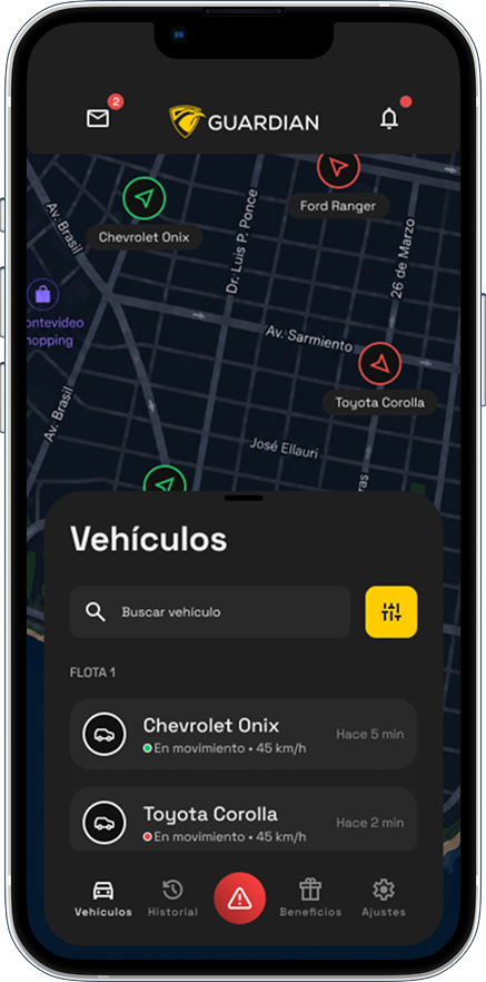
After
Results:
- Vehicles identified by actual make and model, with status and speed visible on the map.
- Vehicle search tool + quick-access filters for managing large fleets.
- List of vehicles with real-time status (“In motion · 45 km/h”) and last activity (“5 min ago”).
- Header with the Guardian brand, notifications, and messages.
- Global navigation with a persistent tab bar.
6
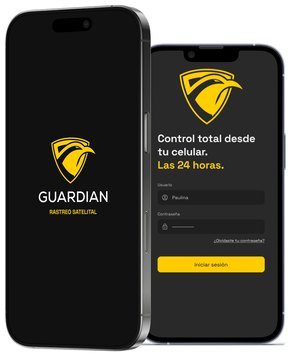
Splash screen
That first second matters.
The splash screen is the user’s first interaction with the app. We’ve designed a clean, straightforward opening: the logo is centred, the background is dark, and there’s a smooth transition to the login screen. With no distractions, Guardian’s brand identity speaks for itself.

7
Handoff
Handoff Designed for Developers.
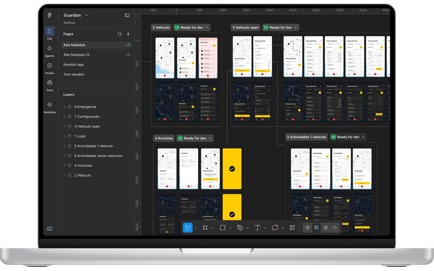
All the work is housed in Figma: wireframes, design tokens, the UI kit, mood boards and final screens, organised into separate pages.
Each handover to the developer includes visual specifications and reference Flutter code where relevant.
8
The results
Guardian is currently under development. The findings of the audit are being implemented gradually alongside the visual redesign. This case study will be updated with results and metrics once the redesigned version goes live.